

本文摘要:
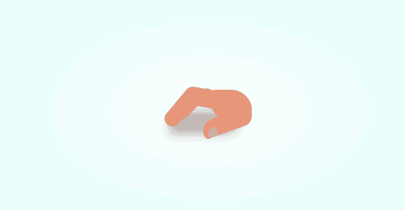
The article "手指打手势" uses HTML and CSS to create an animation of a hand making a gesture with fingers. It includes technical details such as CSS classes like `.hand`, `.thumb`, and `.finger`, along with animations like `tap-upper`, demonstrating how transform, scale, and brightness properties control each finger's movement. Specific custom properties like `--n` and `--scale` influence animation timing and visual effects. The code employs relative positioning, absolute layout, and keyframe animations to simulate a natural hand movement. The work showcases front-end development techniques to replicate human gestures in web design creatively.
— 本文部分摘要灵感源自 DeepSeek 深度思考 ✨
![图片[1]|手指打手势|不死鸟资源网](https://busi.net/wp-content/uploads/2025/06/20250610180902309-image.png)
<!DOCTYPE html>
<html lang="en">

<head>
    <meta charset="UTF-8">
    <meta name="viewport" content="width=device-width, initial-scale=1.0">
    <title>手指打手势</title>
    <script src="https://cdnjs.cloudflare.com/ajax/libs/gsap/3.9.1/gsap.min.js"></script>
    <script src="https://libs.baidu.com/jquery/2.1.4/jquery.min.js"></script>
    <style>
        body {
            margin: 0;
            height: 100vh;
            display: flex;
            align-items: center;
            justify-content: center;
            background: radial-gradient(white, lightcyan)
        }

        .hand {
            width: 16em;
            height: 8em;
            font-size: 10px;
            position: relative;
            color: darksalmon
        }

        .hand::before {
            content: '';
            position: absolute;
            width: 14em;
            height: 4.5em;
            background-color: black;
            border-radius: 4em 1em;
            top: 4em;
            filter: blur(1em) opacity(0.3)
        }

        .palm {
            position: absolute;
            width: 8em;
            height: 6em;
            background-color: currentColor;
            border-radius: 1em 4em;
            right: 0
        }

        .thumb {
            position: absolute;
            width: 9.6em;
            height: 3.2em;
            background-color: currentColor;
            border-radius: 3em 2em 2em 1em;
            right: 0;
            bottom: 1em;
            transform-origin: calc(100% - 2em) 2em;
            transform: rotate(-20deg);
            border-bottom: 0.2em solid rgba(0, 0, 0, 0.1);
            border-left: 0.2em solid rgba(0, 0, 0, 0.1)
        }

        .thumb::before {
            content: '';
            position: absolute;
            width: 1.9em;
            height: 1.9em;
            background-color: rgba(255, 255, 255, 0.3);
            border-radius: 60% 10% 10% 30%;
            bottom: -0.3em;
            left: 0.5em;
            border-right: 0.1em solid rgba(0, 0, 0, 0.1)
        }

        .finger:not(:first-child) {
            position: absolute;
            width: 6.4em;
            height: 3.5em;
            background-color: currentColor;
            right: 5.2em;
            bottom: 4em;
            transform-origin: 100% 2em;
            transform: rotate(10deg);
            --scale: calc(1 - (5 - var(--n)) * 0.2);
            transform: rotate(10deg) scale(var(--scale));
            filter: brightness(calc(100% - (5 - var(--n)) * 10%));
            animation: tap-upper 1.2s ease-in-out infinite;
            animation-delay: calc((var(--n) - 2) * 0.1s)
        }

        @keyframes tap-upper {
            0%, 50%, 100% {
                transform: rotate(10deg) scale(var(--scale))
            }
            40% {
                transform: rotate(50deg) scale(var(--scale))
            }
        }

        .finger:not(:first-child)::before {
            content: '';
            position: absolute;
            width: 9em;
            height: 3em;
            background-color: currentColor;
            right: 4.2em;
            top: 0.2em;
            border-radius: 2em;
            transform-origin: calc(100% - 2em) 2em;
            transform: rotate(-60deg)
        }

        .finger:nth-child(2) {
            --n: 2
        }

        .finger:nth-child(3) {
            --n: 3
        }

        .finger:nth-child(4) {
            --n: 4
        }

        .finger:nth-child(5) {
            --n: 5
        }
    </style>
</head>

<body>
<div class="hand">
    <span class="finger thumb"></span>
    <span class="finger"></span>
    <span class="finger"></span>
    <span class="finger"></span>
    <span class="finger"></span>
    <span class="palm"></span>
</div>
</body>

</html>
本站文章部分内容可能来源于网络,仅供大家学习参考,如有侵权,请联系站长📧ommind@qq.com进行删除处理!
THE END