

本文摘要:
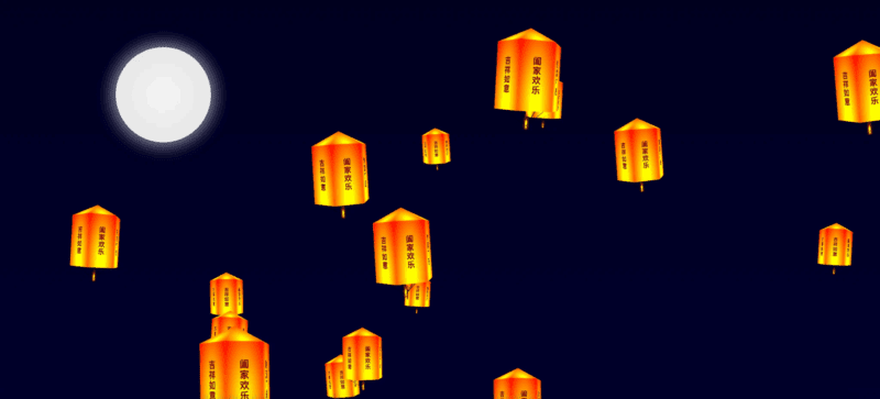
Lanternas Qwens v1.0 et 2.0 sunt simulationes animatae creatae per codicem HTML, CSS et JavaScript. Versio 1.0 repraesentat utentes cum quadratis cum litteris 'Ping', 'An', 'Xi', 'Le', quae ascendunt per animationem. Versio 2.0 innovatur in conspicua forma lampadis illustratae caracteribus incantatorum sicut 'Xin Xiang Shi Cheng', 'Cai Yuan Guang Jin' et vicissim. Lumina, cum gradiente igneo forma rotae et animatione rotatorum multi sidereis, simul prope ad coelum elevantur. Modellus v1.0 lumina sunt fixa, versio autem 2.0 effectus aerios cum levitatione varia habet, pro lubebundis usoribus.
— 本文部分摘要灵感源自 DeepSeek 深度思考 ✨
![图片[1]|孔明灯特效1.0与2.0|不死鸟资源网](https://busi.net/wp-content/uploads/2025/06/20250610192029979-image-1024x465.png)
    <div class="moon"></div>
    <style>
    @keyframes rotateAnimationX {
            0% {
                transform: rotateX(0deg) rotateZ(0deg);
            }

            25% {
                transform: rotateX(5deg) rotateZ(5deg);
            }

            50% {
                transform: rotateX(0deg) rotateZ(0deg);
            }

            75% {
                transform: rotateX(-5deg) rotateZ(-5deg);
            }

            100% {
                transform: rotateX(0deg) rotateZ(0deg);
            }
        }

        @keyframes rotateAnimationY {
            0% {
                transform: rotateY(0deg);

            }

            100% {
                transform: rotateY(360deg);
            }
        }

        @keyframes shape {
            0% {
                background: radial-gradient(at 50% 90%, yellow 10%, #ffae00 40%, red);
            }

            50% {
                background: radial-gradient(at 50% 90%, yellow 20%, #ffae00 50%, red);
            }

            100% {
                background: radial-gradient(at 50% 90%, yellow 10%, #ffae00 40%, red);
            }
        }
* {
            margin: 0;
            padding: 0;
        }

        html,
        body {
            width: 100%;
            height: 100%;

            background: linear-gradient(to bottom, #000022, #000033);
        }

        .moon {
            width: 200px;
            height: 200px;
            border-radius: 50%;
            background: radial-gradient(circle at center, #f6f6f6, #e5e5e5);
            box-shadow: 0 0 30px 10px rgba(255, 255, 255, 0.5);

            position: absolute;
            top: 100px;
            left: 300px;
        }
        </style>
        <script>
        var blessings = [
  "心想事成",
  "平安健康",
  "万事如意",
  "吉祥如意",
  "阖家欢乐",
  "财源广进",
];

class Light {
  constructor(s) {
    const w = 200,
      h = 400;
    this.scale = s;

    this.lightWidth = w;
    this.lightHeight = h;

    this.faceWidth = this.lightWidth / 2;
    this.faceHeight = this.lightHeight / 2;
    this.faceTop = 0;
    this.sin60Width = this.faceWidth * Math.sin(60 * (Math.PI / 180));
    this.faceCenter = this.lightWidth / 2 - this.faceWidth / 2;

    this.fireWidth = this.faceWidth * 0.4;
    this.fireHeight = this.fireWidth * 2;

    this.isUpdate = true;
    this.isRotate = this.scale > .4 ? true : false;

    this.init();
  }

  init() {
    const wrap = this.initWrap();
    const light = this.initLight();
    const fire = this.initFire();

    wrap.appendChild(light);
    light.appendChild(fire);

    const body = document.getElementsByTagName("body")[0];

    body.appendChild(wrap);
  }

  initWrap() {
    const wrap = document.createElement("div");
    wrap.className = "light-wrap";
    wrap.style.position = "fixed";
    wrap.style.zIndex = this.lightHeight + this.lightWidth;

    let top = parseInt(Math.random() * window.innerHeight);
    let left = parseInt(Math.random() * window.innerWidth);

    wrap.style.top = top + "px";
    wrap.style.left = left + "px";
    wrap.style.transform = `scale(${this.scale})`

    wrap.style.height = this.lightHeight + "px";
    wrap.style.width = this.lightWidth + "px";

    const update = () => {
      const step = 0.2;

      top - step * 2 > -this.lightHeight
        ? (top -= step * 2)
        : (top = window.innerHeight);
      left - step > -this.lightWidth
        ? (left -= step)
        : (left = window.innerHeight);
      wrap.style.top = top + "px";
      wrap.style.left = left + "px";
      setTimeout(update, 1000 / 30);
    };
    if (this.isUpdate) {
      update();
    }

    return wrap;
  }

  initLight() {
    const light = document.createElement("div");
    light.className = "light";

    light.style.height = this.lightHeight + "px";
    light.style.width = this.lightWidth + "px";

    light.style.position = "relative";

    light.style.perspective = this.faceWidth * 10 + "px";
    light.style.perspectiveOrigin = `center ${this.lightHeight / 2}px`;
    light.style.transformStyle = "preserve-3d";

    light.style.position = "relative";

    light.style.animation = `rotateAnimationX ${
      parseInt(Math.random() * 10) + 5
    }s linear infinite`;

    for (let i = 0; i < 6; i++) {
      const face = this.initFace(i * 60, i);
      light.appendChild(face);
    }

    return light;
  }

  initFace(deg, _i) {
    const face = document.createElement("div");
    face.className = "face";

    face.style.height = this.faceHeight + "px";
    face.style.width = this.faceWidth + "px";

    face.style.transformStyle = "preserve-3d";
    face.style.position = "absolute";

    face.style.top = 0;
    face.style.left = this.faceCenter + "px";
    face.style.transformOrigin = `50% 50% ${this.sin60Width}px`;

    face.style.transform = `translateZ(${
      -1 * this.sin60Width
    }px) rotateY(${deg}deg)`;

    const rotate = () => {
      deg++;
      face.style.transform = `translateZ(${
        -1 * this.sin60Width
      }px) rotateY(${deg}deg)`;
      setTimeout(rotate, 1000 / 30);
    };
    this.isRotate && rotate();

    const faceTop = this.initFaceTop();
    const faceSqure = this.initFaceSqure(_i);
    const faceLine = this.initFaceLine();

    face.appendChild(faceTop);
    face.appendChild(faceSqure);
    face.appendChild(faceLine);

    return face;
  }

  initFaceTop() {
    const faceTop = document.createElement("div");
    faceTop.className = "face-top";

    faceTop.style.width = this.faceWidth + "px";
    faceTop.style.height =
      this.sin60Width / Math.cos(30 * (Math.PI / 180)) + "px";
    faceTop.style.background = `radial-gradient(at 50% 90%, yellow 10%, #ffae00 40%, red)`;
    faceTop.style.transform = `rotateX(-60deg)`;
    faceTop.style.transformOrigin = `0 100%`;
    faceTop.style.clipPath = `polygon(50% 0%, 0% 100%, 100% 100%)`;

    return faceTop;
  }

  initFaceSqure(_i) {
    const faceSqure = document.createElement("div");
    faceSqure.className = "face-squre";

    faceSqure.style.height = this.faceHeight + "px";
    faceSqure.style.width = this.faceWidth + "px";
    faceSqure.style.background = `radial-gradient(at 50% 70%, #0d0034 10%, #381460 40%, red)`;
    faceSqure.style.animation = `shape 2s linear infinite`;

    const word = this.initWord(_i);
    faceSqure.appendChild(word);

    return faceSqure;
  }

  initWord(_i) {
    const word = document.createElement("div");
    word.className = "word";

    word.innerText = blessings[_i];

    word.style.height = "100%";
    word.style.width = "100%";

    word.style.textAlign = "center";
    word.style.writingMode = "vertical-rl";
    word.style.lineHeight = this.faceWidth + "px";
    word.style.transform = "scaleX(-1)";
    word.style.letterSpacing = "2px";
    word.style.fontFamily = "楷体";
    word.style.fontWeight = "bold";
    word.style.userSelect = 'none'
    word.style.color = 'rgb(126 0 0)'

    word.style.fontSize = parseInt(this.faceWidth / 4) + "px";

    return word;
  }

  initFaceLine() {
    const faceLine = document.createElement("div");
    faceLine.className = "face-line";

    faceLine.style.width = this.faceWidth + "px";
    faceLine.style.height =
      this.sin60Width / Math.cos(30 * (Math.PI / 180)) + "px";
    faceLine.style.background = `linear-gradient(to right, transparent 48%, black 48%, transparent 52%)`;
    faceLine.style.transform = `rotateX(60deg)`;
    faceLine.style.transformOrigin = `0 0`;

    return faceLine;
  }

  initFire() {
    const fire = document.createElement("div");
    fire.className = "fire";

    fire.style.position = `absolute`;
    fire.style.top =
      this.faceHeight + this.faceWidth - 0.2 * this.faceWidth + "px";
    fire.style.left = this.lightWidth / 2 - this.fireWidth / 2 + "px";
    fire.style.width = this.fireWidth + "px";
    fire.style.height = this.fireHeight + "px";
    fire.style.perspective = this.faceWidth * 10 + "px";
    fire.style.perspectiveOrigin = `center ${this.faceHeight}px`;
    fire.style.transformStyle = `preserve-3d`;

    const firEItem = this.initFireItem(30);
    fire.appendChild(firEItem);
    return fire;
  }

  initFireItem(d) {
    const fireItem = document.createElement("div");

    fireItem.style.position = `absolute`;
    fireItem.style.height = `100%`;
    fireItem.style.width = `100%`;
    fireItem.style.background = `radial-gradient(at 50% 80%, yellow 10%, #8B0000 20%, transparent 40%, transparent)`;
    fireItem.style.transform = `rotateY(${d}deg)`;

    return fireItem;
  }
}

const lightList = []

    for (let i = 0; i < 18; i++) {
        lightList.push(Math.random() * (.8 - .2) + .2)
    }

    lightList.sort().forEach(i => new Light(i))
    </script>
孔明灯特效1.0
在我们非常喜庆的 “冥” 字幕基础上,改成特别版,“孔明灯” 特效。
![图片[2]|孔明灯特效1.0与2.0|不死鸟资源网](https://busi.net/wp-content/uploads/2025/06/20250610192207509-image-1024x778.png)
复制下方代码,点这里查看演示:在线 html
<!DOCTYPE html>
<html lang="en">
<head>
<meta charset="UTF-8">
<meta name="viewport" content="width=device-width, initial-scale=1.0">
<title>孔明灯效果-小归客</title>
<style>
  body, html {
    margin: 0;
    padding: 0;
    width: 100%;
    height: 100%;
    overflow: hidden;
  }
  .gradient-background {
    background: linear-gradient(to bottom, black 0%, black 100%);
    position: absolute;
    width: 100%;
    height: 100%;
  }
  .falling-block {
    position: absolute;
    background-color: red; /* 修改背景颜色为红色 */
    color: black;
    font-size: 24px;
    font-weight: bold;
    text-align: center;
    border-radius: 10px;
    opacity: 0.8;
    display: flex;
    align-items: center;
    justify-content: center;
  }
</style>
</head>
<body>

<div class="gradient-background"></div>

<script>
  // 创建方块的数量
  const numberOfBlocks = 50;

  // 创建方块并添加到页面
  function createFallingBlocks() {
    const characters = ['平','安','喜', '乐']; // 定义要显示的字符数组
    for (let i = 0; i < numberOfBlocks; i++) {
      const block = document.createElement('div');
      block.classList.add('falling-block');
      // 从数组中随机选择一个字符作为文本内容
      block.textContent = characters[Math.floor(Math.random() * characters.length)];
      block.style.left = Math.random() * 100 + 'vw';
      block.style.width = Math.random() * 50 + 'px';
      block.style.height = Math.random() * 50 + 'px';
      block.style.top = '100vh'; // 初始位置在屏幕底部外
      block.style.animation = `rise ${Math.random() * 5 + 2}s linear infinite`;
      document.body.appendChild(block);
    }
  }

  // 定义方块上升的动画
  function rise() {
    const keyframes = `
      0% {
        transform: translateY(0);
        opacity: 0;
      }
      100% {
        transform: translateY(-100vh);
        opacity: 1;
      }
    `;
    const style = document.createElement('style');
    style.innerHTML = `
      @keyframes rise {
        ${keyframes}
      }
    `;
    document.head.appendChild(style);
  }

  // 调用函数
  rise();
  createFallingBlocks();
</script>

</body>
</html>
本站文章部分内容可能来源于网络,仅供大家学习参考,如有侵权,请联系站长📧ommind@qq.com进行删除处理!
THE END